Context
A 30-day audit of the store’s Meta Ads account showed a healthy 4.20% account-level CTR. People were clicking. The weak point was what happened after the click — so instead of raising the ad budget, the store itself was rebuilt.
The challenge
The store ran on an older, heavily customised “vintage” Shopify theme — no Online Store 2.0, no drag-and-drop sections. A premium-looking redesign had to be hand-built inside it, without breaking the live store and without relying on theme updates.
The work
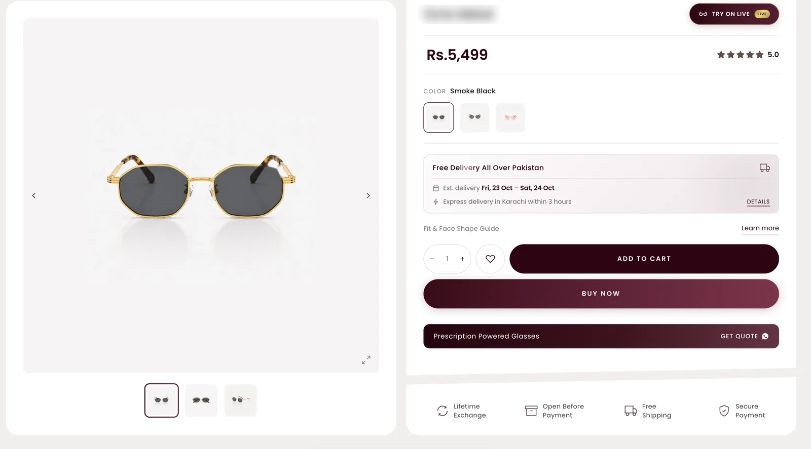
- A product page written from scratch. Gallery, info card, a tilted “trust slab” placed where hesitation peaks, sticky glider tabs and an express-delivery glass modal — plus Product JSON-LD so Google reads every product properly.
- Content the team can edit without code. Short titles, spec lines, card ribbons, product tabs and menu images all come from metafields.
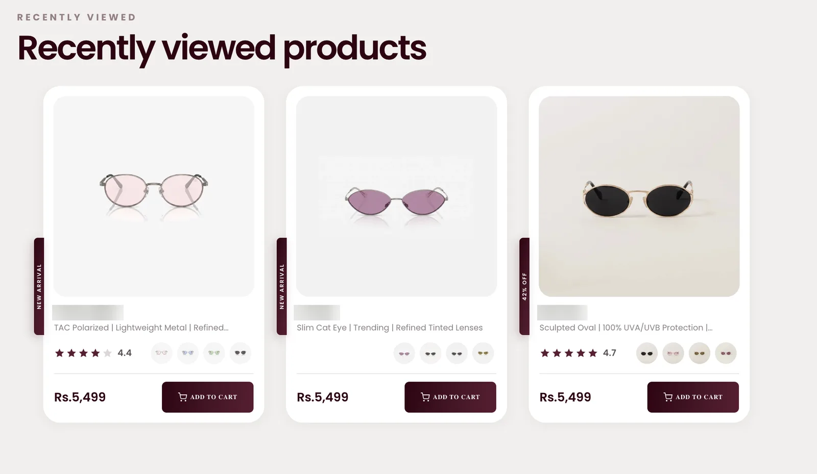
- One card for the whole store. A single shared product-card snippet powers the home page, collections and “you may also like”. A “Limited Edition” ribbon turns gold automatically. Its CSS and JS are guarded so they load once, however many sections use the card.
- Add-to-cart that doesn’t lose the sale. A sticky glass “pill” bar follows the shopper, opens a variant picker first so a size or colour can’t be skipped, and adds to cart over AJAX without a page reload.
- A virtual try-on built into the product page — covered in its own deep dive ↗.
How it was shipped safely
All work happened on a duplicate theme and was reviewed through preview links before going live. Every section carries its own scoped CSS, sizing uses clamp() so it adapts to every screen, and hover effects only run on real desktops.
This case study describes the build. It does not attribute revenue or conversion changes to it without measured evidence.